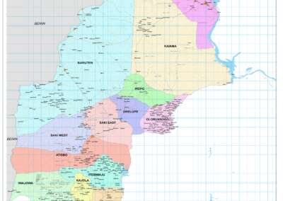
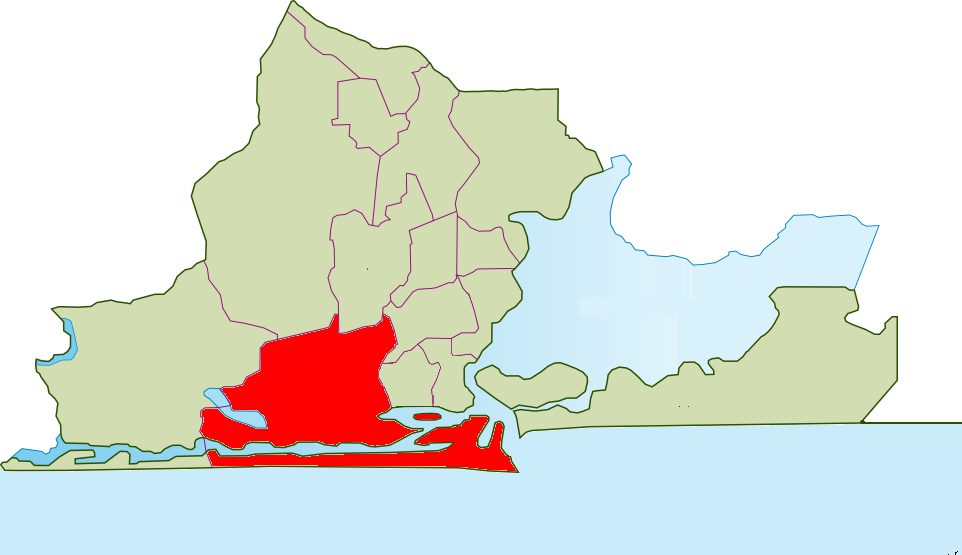
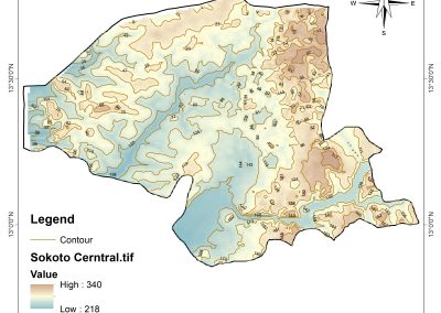
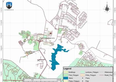
A choropleth is a type of thematic map (i.e a map that focus on specific themes like population, climate or land use) that uses shading, coloring, or patterns to show the value of a variable across geographic areas such as countries, states, local government areas (LGA) or neighborhoods.
It answers the question: “How does this value vary by location?”
For example:
- A darker color might show a higher population
- A lighter color can show a lower rate
Why are choropleth maps important?
- They Make Data Instantly Visual: Choropleth maps make data easy to interpret even for non -experts. Rather than reading a tables of numbers, users can see patterns immediately.
- They Help Identify Geographic Patterns: With choropleth map, you can simply spot areas with high or low value, regional cluster, trends related to location (e.g urban vs rural, coastal vs island).
- It Is Useful for Decision Making: Choropleth map supports policy planning, risk assessment, education and public communication of data.
- It Is Great for Comparing Areas: They are specially useful when comparing population densities, access to schools or clinic, income levels, crime rates.
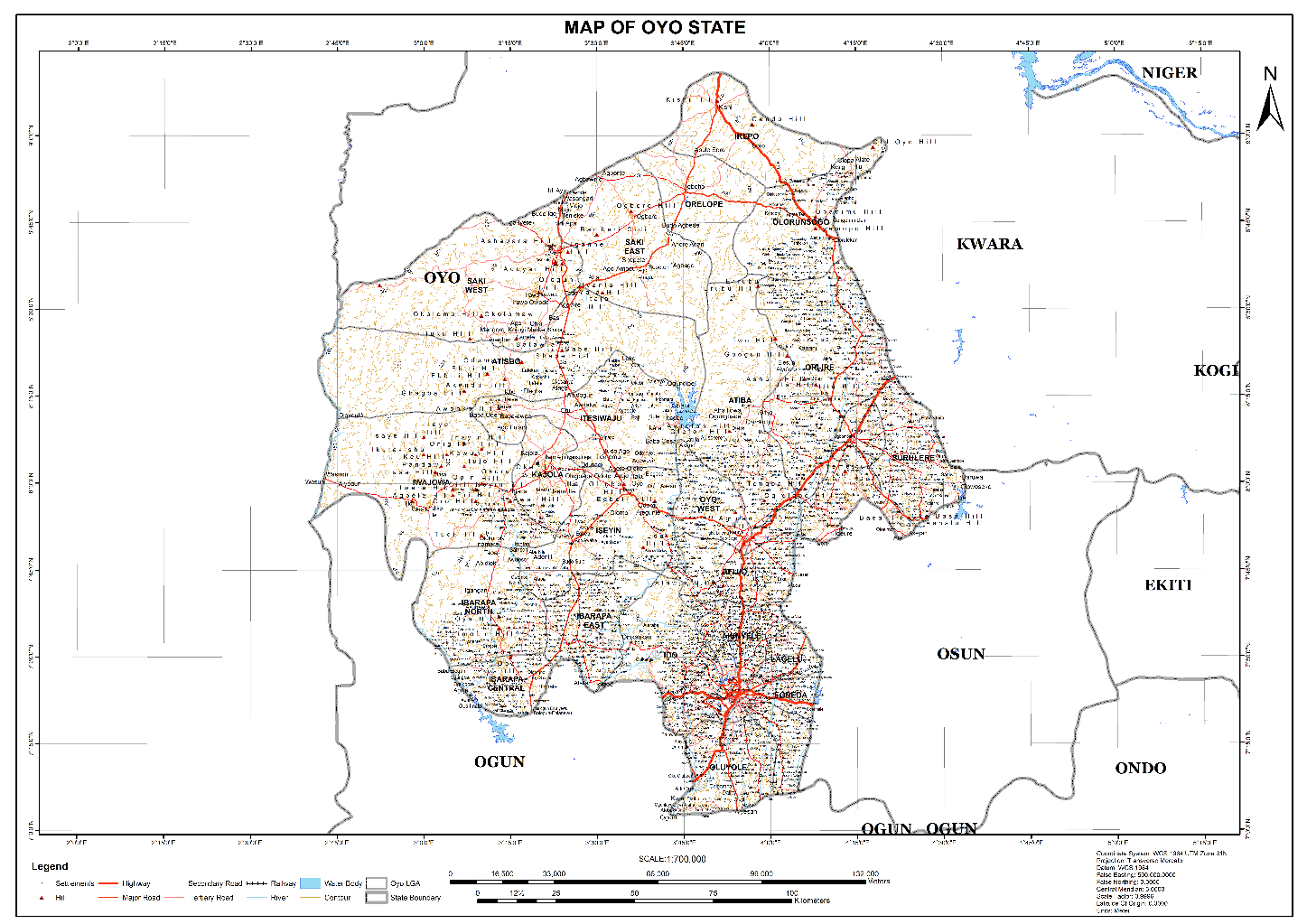
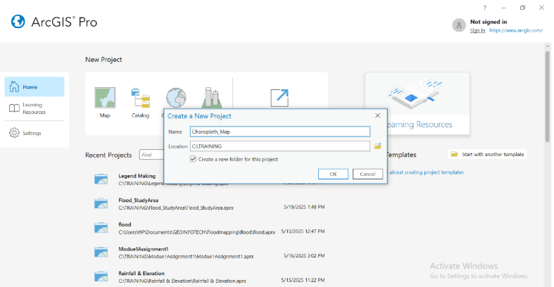
HOW TO CREATE A CHOROPLETH MAP IN ARCGIS PRO
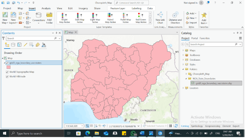
Open ArcGIS Pro, start a new project and Load your data
In your catalog pane, drag your polygon shapefile or feature into the map view. E.g Nigeria_states.shp.
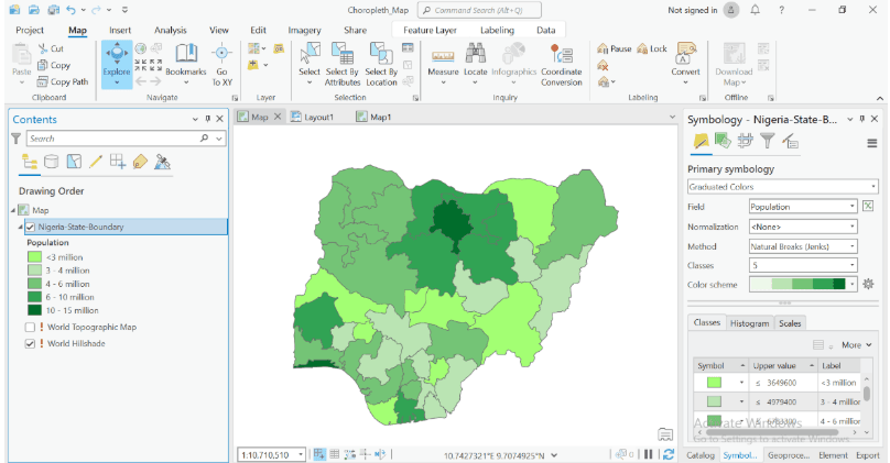
Open the symbology pane
- In the content pane, right click in the layer name and click symbology
- Change the symbology from “single symbol” to graduated colors.
- In the symbology panel, under field, choose the attribute you want to map.
Example: population_density, poverty_rate, e.t.c
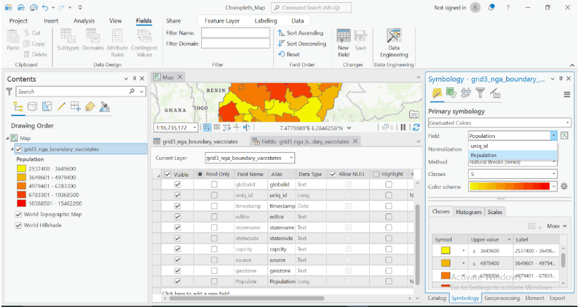
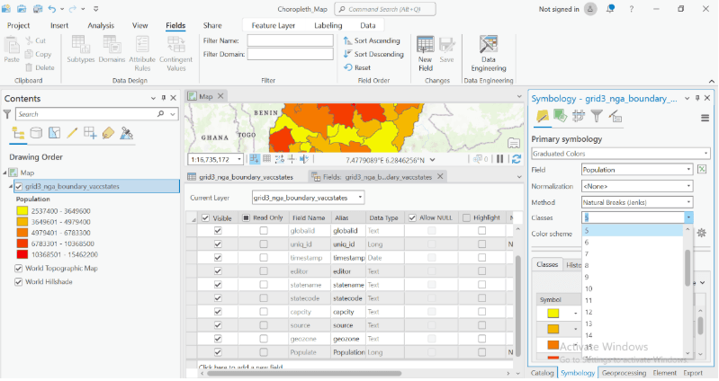
Choose a classification method
- Natural breaks(Jenks) – great for highlighting natural groupings
- Quartile- put equal area of areas in each class
- Equal Interval- evenly spaced numeric ranges
Set the number of classes (usually 4-6 for clarity)
Choose a color ramp: Pick a color that fits your themes
- ArcGIS pro has several preset ramps
- Best Practice: Use darker colors for higher values and lighter colors for lower values
Add Map Element
- Switch to layout view (insert layout via the insert tab)
- Add a legend, title, north arrow, and scale bar using insert tab
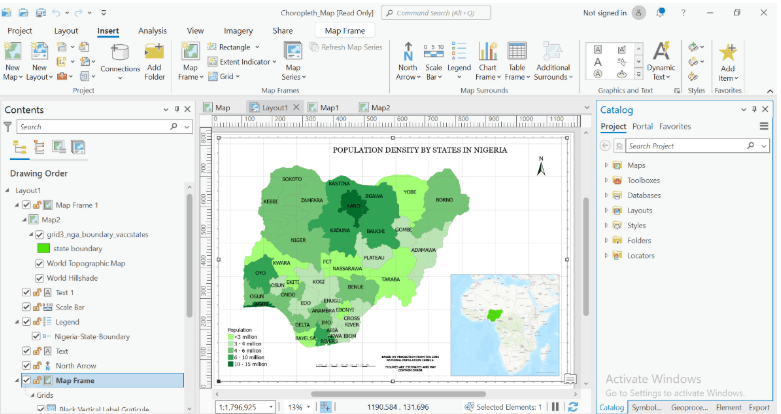
Export your map
- Go to the share tab
- Click export layout to save your map as PDF, PNG, or JPEG.