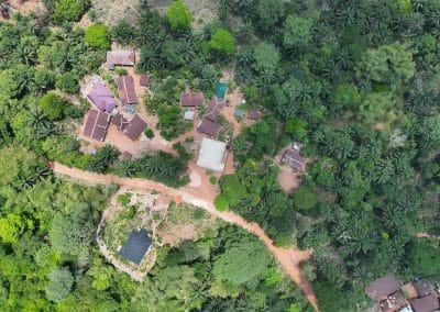
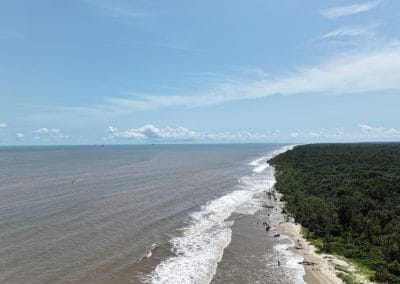
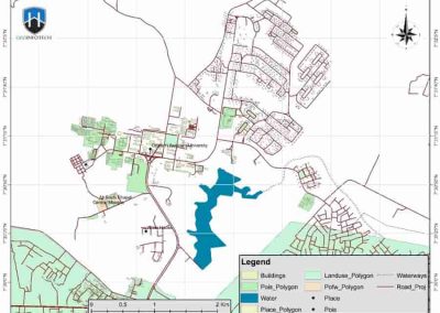
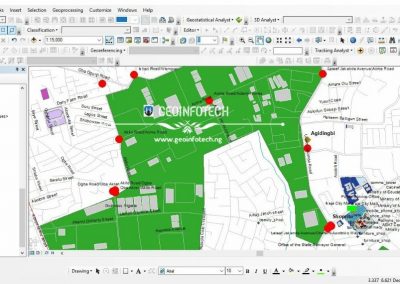
GIS map is an indispensable tool for displaying geophysical data about the world on the screen in a dynamic and interactive way. According to the problem to be solved, there are many types of map mapping in GIS, from category maps to bubble maps to heat maps. GIS maps are dynamic and interactive. You can view these functions by highlighting the previously invisible functions and viewing the changes of these functions over time according to the set properties.
GIS Map: How Does It Works
Since the human eye is designed to respond to different colors and shapes, GIS maps usually convert real-world geospatial data into colored patterns or shapes, which speeds up information processing, speeds up decision-making, and provides More information.
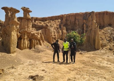
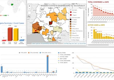
In the purely technical aspect of cartography, the GIS system assigns specific data elements to spatial points with longitude and latitude. Then, the spatial analysis will measure the distance between these points and determine the relationship between them to better understand the earth. Geographers and other GIS professionals can view various types of statistical information, including the distribution of customer groups and demand for products or services, demographic information, and other data.
Types Of Mapping In GIS
Depending on what exactly needs to be visualized, there are many different types of mapping in GIS. It can be anything from population density to crop classification. Some of the most common types of GIS maps are: category, heat, cluster, bubble, and quantity ones.
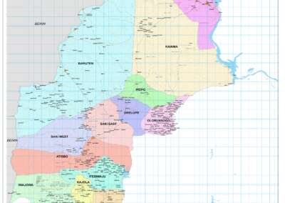
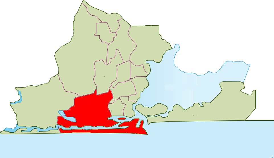
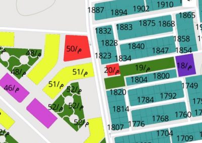
Category Maps
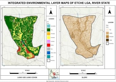
When you need to understand exactly which portions on the map correspond to which data segment, there is nothing else like a category GIS map. This is by far one of the most common types of GIS mapping, since it is the easiest to create. A specific category, or attribute, is assigned its own distinct color. The result is a convenient map of differently colored patches, each representing a particular category.
Heat Maps
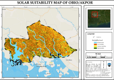
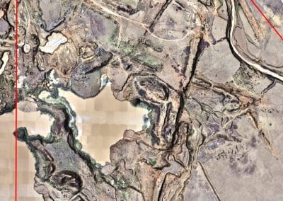
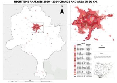
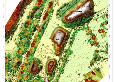
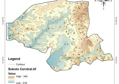
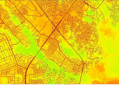
Often mistakenly applied to quantity maps, the term “GIS heat map” actually describes a unique mapping convention. When the data you need to represent on the map is incredibly dense and mixed up, a general idea of “warmer” and “cooler” regions can help. Especially, if you know that the hottest spots represent the highest density of the given quantity.
It is more or less universally accepted that red stands for heat, while blue means cold. Not that it is incredibly precise, but it definitely provides a rough picture of quantity distribution.
Cluster Maps
This type successfully combines the use of colors, shapes, and labels to cluster densely packed points of data together. In other words, there are too many points to be displayed individually on the GIS map, so they are fused into a single cluster point for convenience.
Bubble Maps
A bubble GIS map is an example of using shapes and the difference in their size to simplify the layout of complex numerical data. For example, imagine you need to compare the amount of people using certain slang words for different locations. Bigger and smaller bubbles on the GIS map will represent more and less people, respectively. Instead of boring rows and columns of numbers, you get bubbles. This provides a quick general understanding of the relationship between quantities and locations at a glance, saving time and effort.
Quantity Maps
A GIS heat map is color-coded, but uses different shades of the same color to show the variety in quantities of something depicted on the map. It is a perfect GIS mapping solution to the problem of visualizing a lot of detailed data spread over a large area