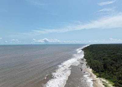
Flooding remains one of the most disruptive environmental hazards in Nigeria. It affects lives, livelihoods, transport networks, agriculture, and critical infrastructure across many states every year. The challenge is not only responding after a flood happens, but also identifying risk early enough to support better preparedness.
That is the problem the Nigeria Flood Prediction Dashboard was built to address.
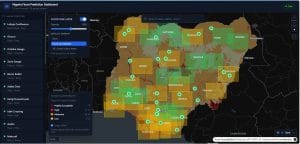
This project brings together near-real-time hydrological and weather data, machine learning forecasts, and satellite-based risk layers into a single interactive platform. The result is a dashboard that helps users monitor gauge stations, view short-term flood probabilities, and explore flood-prone areas across Nigeria on a live map.
Why This Dashboard Matters
Flood monitoring is often fragmented. River levels may live in one system, weather signals in another, and geospatial risk context in yet another. Decision-makers then have to piece everything together under time pressure.
The Nigeria Flood Prediction Dashboard simplifies that workflow by combining:
- river gauge observations
- meteorological data
- machine learning flood forecasts
- geospatial flood-risk overlays
- station-level charts and map-based analysis
Instead of jumping across multiple tools, users can inspect all of these signals in one place.
What the Dashboard Does
At a high level, the platform is designed to answer three practical questions:
- What is happening right now at monitored gauge stations?
- What is the likely flood risk over the next few hours or days?
- Which areas are historically or physically more susceptible to flooding?
To support that, the dashboard includes:
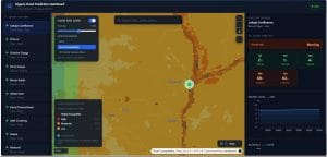
- a map of monitored stations across Nigeria
- 6-hour, 12-hour, 24-hour, 48-hour, and 72-hour flood forecasts
- station detail panels with water level and rainfall charts
- state-level flood-risk areas on the map
- satellite overlays such as flood susceptibility and JRC Global Surface Water
- live backend services that expose data through REST APIs and WebSockets
How the System Works
The dashboard is built as a full-stack geospatial and machine learning platform.
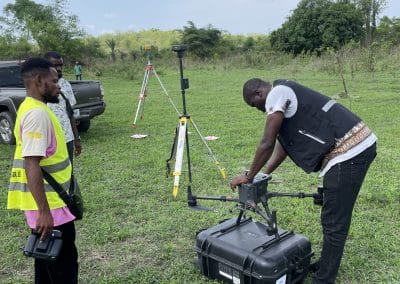
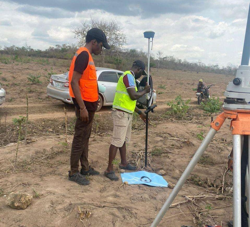
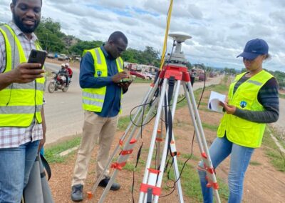
1. Data Ingestion
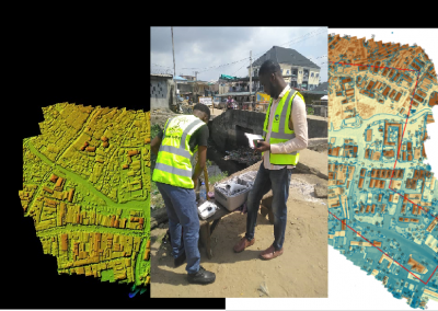
The system collects hydrological and weather inputs from external sources and scheduled ingest jobs. These jobs pull river and meteorological data, refresh supporting spatial layers, and store the results in the platform database.
The project also supports satellite-driven layers through Google Earth Engine workflows. Those layers are processed, clipped to Nigeria, exported as cloud-optimized rasters, and served as map tiles.
2. Time-Series and Spatial Storage
Data is stored in TimescaleDB with PostGIS, which makes it possible to manage both time-series observations and spatial datasets in one database environment.
This is important because flood prediction depends on both:
- measurements over time, such as water level and rainfall
- location-based context, such as station position and flood-prone terrain
3. Feature Engineering and Machine Learning
The system transforms raw observations into model-ready features such as:
- current water level
- flow rate
- short-term water level changes
- rolling rainfall totals
- estimated soil moisture proxy
- river level as a percentage of bank-full condition
These features are then passed into machine learning models that estimate flood probability at multiple forecast horizons. The architecture combines XGBoost and LSTM models, allowing the platform to capture both structured tabular patterns and temporal behavior.
4. API and Tile Services
The backend is powered by FastAPI, which exposes station data, forecasts, alert information, and map overlay metadata. Raster layers are served as web map tiles through TiTiler, making large geospatial datasets usable in a browser-based dashboard.
5. Interactive Frontend
The user interface is built with React, Vite, MapLibre, and ECharts. This gives the platform an interactive map experience, fast UI rendering, and compact visual summaries for forecasts and time-series behavior.
Users can:
- Select a gauge station
- Inspect forecast probabilities by time horizon
- review water level behavior
- switch satellite overlays on and off
- Compare the flood-risk context directly on the map
Flood Susceptibility and JRC Global Surface Water
Two important overlays in the dashboard help give spatial context to the forecast data.
Flood Susceptibility Layer
This layer is clipped to Nigeria and classified into four categories:
- Highly Susceptible
- High
- Moderate
- Low
It helps users see which areas are structurally more prone to flooding, even before looking at short-term forecast outputs.
JRC Global Surface Water Layer
This layer provides a historical surface water context derived from satellite observations. It helps reveal places where water occurrence has been persistent or significant over time, adding another lens for understanding landscape-level flood behavior.
Together, these layers help users interpret not just forecast probabilities, but also the broader physical and environmental context behind flood exposure.
A Practical User Experience
One of the strongest parts of the dashboard is that it is designed for direct interpretation, not just technical demonstration.
For example:
- A user can click a station and instantly see short-term flood probabilities
- The map highlights at-risk areas visually
- The selected overlay updates the legend automatically
- The right-side panel provides a clearer view of water level behavior for the selected station
This makes the platform useful for analysts, planners, emergency coordinators, researchers, and anyone who needs a clearer picture of flood conditions without digging through raw datasets manually.
Technology Stack
The dashboard combines a modern geospatial and data engineering stack:
- React + Vite for the frontend
- MapLibre GL for interactive web mapping
- ECharts for charting
- FastAPI for backend APIs
- Redis for caching
- TimescaleDB + PostGIS for time-series and spatial storage
- BentoML for serving machine learning models
- MLflow for experiment tracking
- MinIO for raster and artifact storage
- TiTiler for serving cloud-optimized geospatial tiles
- Docker Compose for local orchestration
- Google Earth Engine for spatial flood-risk layer generation
Why This Approach Is Valuable
This dashboard is valuable because it does more than visualize flood data. It creates a connected workflow from data collection to model inference to map-based interpretation.
That means the platform can support:
- earlier awareness of elevated flood risk
- faster review of station behavior
- clearer communication of risk through maps and classes
- stronger integration between environmental data and geospatial analysis
It also demonstrates how local development environments can still power a serious, near-real-time decision-support tool when they are connected to live or regularly refreshed external data sources.
Looking Ahead
The Nigeria Flood Prediction Dashboard already provides a strong foundation, but it also opens the door for future enhancements, such as:
- more station coverage across Nigeria
- stronger alerting workflows
- administrative and reporting views
- mobile-friendly emergency access
- scenario-based planning tools
- richer flood extent products from additional satellite workflows
As climate risk intensifies and flood events become more disruptive, systems like this can help move monitoring from reactive reporting toward proactive decision support.
Conclusion
The Nigeria Flood Prediction Dashboard is a practical example of how data engineering, machine learning, geospatial infrastructure, and thoughtful interface design can come together to solve a real-world problem. By combining near-real-time observations, forecast modeling, and map-based risk layers in one experience, the platform helps make flood intelligence more accessible, interpretable, and actionable. In simple terms, it gives users a better way to see what is happening, what may happen next, and where the greatest flood vulnerability lies.